Plots and graphics
The scatter and heatmap plots can be used in two ways:
Open the plot in an interactive window with zoom and other features. This is also compatible with Jupyter/IPython notebooks to render the plots inline.
Generate a static image plot with the
--output/-ooption.- While PDF is a good choice to generate publication-quality figures that can be easily edited in Inkscape or Adobe Illustrator, other formats will work, indicated by the output filename extension – e.g. “-o myplot.png” to create PNG, or “-o myplot.svg” to create SVG.
(The diagram command can only generate a PDF file.)
As with any CNVkit command, the -h option will show the complete list of
options available:
cnvkit.py scatter -h
cnvkit.py diagram -h
cnvkit.py heatmap -h
scatter
Plot bin-level log2 coverages and segmentation calls together. Without any further arguments, this plots the genome-wide copy number in a form familiar to those who have used array CGH.
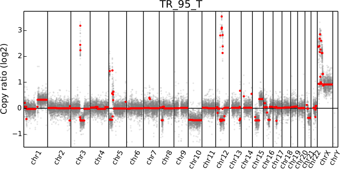
cnvkit.py scatter Sample.cnr -s Sample.cns
# Shell shorthand
cnvkit.py scatter -s TR_95_T.cn{s,r}
The options --chromosome and --gene (or their single-letter equivalents)
focus the plot on the specified region:
cnvkit.py scatter -s Sample.cn{s,r} -c chr7
cnvkit.py scatter -s Sample.cn{s,r} -c chr7:140434347-140624540
cnvkit.py scatter -s Sample.cn{s,r} -g BRAF
In the latter two cases, the genes in the specified region or with the specified
names will be highlighted and labeled in the plot.
The arguments -c and -g can be combined to e.g. highlight specific genes
in a wider context:
# Show a chromosome arm, highlight one gene
cnvkit.py scatter -s Sample.cn{s,r} -c chr5:100-50000000 -g TERT
# Show the whole chromosome, highlight two genes
cnvkit.py scatter -s Sample.cn{s,r} -c chr7 -g BRAF,MET
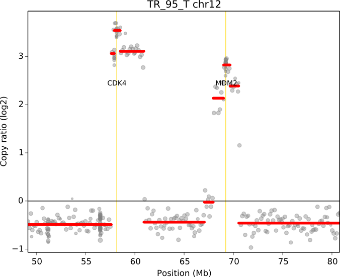
# Highlight two genes in a specified range
cnvkit.py scatter -s TR_95_T.cn{s,r} -c chr12:50000000-80000000 -g CDK4,MDM2
When a chromosomal region is plotted with CNVkit’s “scatter” command , the size of the plotted datapoints is proportional to the weight of each point used in segmentation – a relatively small point indicates a less reliable bin. Therefore, if you see a cluster of smaller points in a short segment (or where you think there ought to be a segment, but there isn’t one), then you can cast some doubt on the copy number call in that region. The dispersion of points around the segmentation line also visually indicates the level of noise or uncertainty.
The bin-level log2 ratios or coverages can also be plotted without segmentation calls:
cnvkit.py scatter Sample.cnr
This can be useful for viewing the raw, un-corrected coverage depths when deciding which samples to use to build a profile, or simply to see the coverages without being helped/biased by the called segments.
The --trend option (-t) adds a smoothed trendline to the plot. This can
be helpful if the segmentation is not available, or if you’re skeptical of the
segmentation in a region.
Selection and highlighting
Chromosome-level views are controlled with the --chromosome/-c and
--gene/-g options:
A gene name (e.g.
-g TERT) or multiple gene names separated by commas (e.g.-g CDK4,MDM2) will plot the genomic around that gene, or genes, and highlight the gene or genes with a vertical gold stripe.- If multiple genes, they must all be on the same chromosome.
- The
--width/-wargument determines the size of the plotted genomic region, in terms of basepairs flanking the selected region. - Any other genes in the plotted region will not be shown unless also
specified with
-g.
A chromosome name alone (e.g.
-c chr5) plots the whole chromosome. (No genes are highlighted.)A region label with chromosome name and 1-based start and end coordinates (e.g.
-c chr5:1000000-4000000) plots the specified region, with the start and end coordinates as the x-axis limits. All genes in this region (that are labeled in the input .cnr file) are highlighted and labeled.- If the start or end coordinate is left off (e.g.
-c chr5:-4000000or-c chr7:140000000-), the region is extended to the end of the chromosome in the direction of the open coordinate, i.e. it does what you’d think. If both are left off but-remains (e.g.-c chrY:-), the whole chromosome is shown, with all genes highlighted. - If
-cis used,-wis ignored – only the specified genomic region will be shown, with no padding. - The
-goption overrides the default behavior of showing all genes in the selection – only the genes specified with-gwill be highlighted and labeled. To not show any genes, specify an empty string:-g '' - Special behavior occurs if there are no genes in the selected region:
Instead, the selection itself is treated as a “gene”, highlighted and
labeled with the string “Selection”, with padding controlled by
-w. This behavior can be blocked by specifying an empty list of genes:-g ''– then the specified region will be plotted as usual, with nothing highlighted and no padding.
- If the start or end coordinate is left off (e.g.
To create multiple region-specific plots at once, the regions of interest can be
listed in a separate file and passed to the scatter command with the
-l/--range-list option. This is equivalent to creating the plots
separately with the -c option and then combining the plots into a single
multi-page PDF.
Note
Only targeted genes can be highlighted and labeled; genes that are not included in the list of targets are not labeled in the .cnn or .cnr files and are therefore invisible to CNVkit.
SNV b-allele frequencies
The allelic frequencies of heterozygous SNPs can be viewed alongside copy number
by passing variants as a VCF file with the -v option.
These allele frequences are rendered in a subplot below the CNV scatter plot.
cnvkit.py scatter Sample.cnr -s Sample.cns -v Sample.vcf
If only the VCF file is given by itself, just the allelic frequencies are plotted:
cnvkit.py scatter -v Sample.vcf
When given segments, the plot will show the mean b-allele frequency values above and below 0.5 of SNVs falling within each segment. Divergence from 0.5 indicates loss of heterozygosity (LOH) or allelic imbalance in the tumor sample.
cnvkit.py scatter -s Sample.cns -v Sample.vcf -i TumorID -n NormalID
Given a VCF with only the tumor sample called, it is difficult to focus on just the informative SNPs because it’s not known which SNVs are present and heterozygous in normal, germline cells. Better results can be had by giving CNVkit more information:
- Call somatic mutations using paired tumor and normal samples. In the VCF, the somatic variants should be flagged in the INFO column with the string “SOMATIC”. (MuTect does this automatically.) Then CNVkit will skip these for plotting.
- Add a “PEDIGREE” tag to the VCF header, listing the tumor sample as “Derived” and the normal as “Original”. (MuTect doesn’t do this, but it does add a nonstandard GATK header that CNVkit can extract the same information from.)
- In lieu of a PEDIGREE tag, tell CNVkit which sample IDs are the tumor and normal using the
-iand-noptions, respectively. - If no paired normal sample is available, you can still filter for likely informative SNPs by intersecting your tumor VCF with a set of known SNPs such as 1000 Genomes, ESP6500, or ExAC. Drop the private SNVs that don’t appear in these databases to create a VCF more amenable to LOH detection.
diagram
Draw copy number (either individual bins (.cnn, .cnr) or segments (.cns)) on chromosomes as an ideogram. If both the bin-level log2 ratios and segmentation calls are given, show them side-by-side on each chromosome (segments on the left side, bins on the right side).
cnvkit.py diagram Sample.cnr
cnvkit.py diagram -s Sample.cns
cnvkit.py diagram -s Sample.cns Sample.cnr
If bin-level log2 ratios are provided (.cnr), genes with log2 ratio values beyond a fixed threshold will be labeled on the plot. This plot style works best with target panels of a few hundred genes at most; with whole-exome sequencing there are often so many genes affected by CNAs that the individual gene labels become difficult to read.
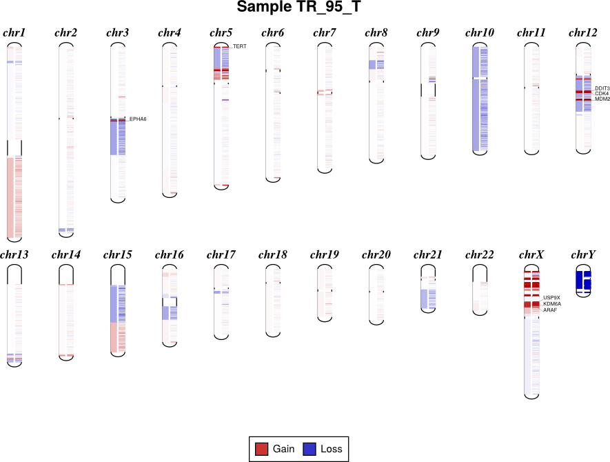
By default, the sex chromosomes X and Y are colorized relative to the expected
ploidy, i.e. for male samples analyzed with default options, where the X
chromosome in the input .cnr and .cns files has a log2 copy ratio near -1.0, in
the output diagram it will be shown as neutral copy number (white or faint
colors) rather than a loss (blue), because the sample’s X chromosome (and Y) is
recognized and expected to be haploid. (See Chromosomal sex.)
The sample sex can be specified with the -x/--sample-sex option, or will
otherwise be guessed automatically.
This visual correction is done by default, but can be disabled with the option
--no-shift-xy.
To get the same results in text form, i.e. a table of the amplified and deleted genes in a sample, use the genemetrics command.
Reducing cluttered gene labels
With tumor WGS or exome samples, the diagram output often appears
extremely cluttered with hundreds or thousands of genes labeled.
You can reduce the number of labels by using a higher threshold (diagram -t)
to limit labeling to deep deletions and high-level amplifications. The
genemetrics command can help you determine the log2 value of genes of
interest, and then a -t value slightly below that will disply only
alterations at least that exteme.
To reduce the number of false-positive calls in the .cns file (see Calling copy number gains and losses), consider:
- Making the initial segmentation more stringent with segment -t or a larger bin size
- Filtering segments by confidence interval via segmetrics –ci and call –filter ci
Alternatively, simply stick to the scatter and heatmap plots for visualizing these samples.
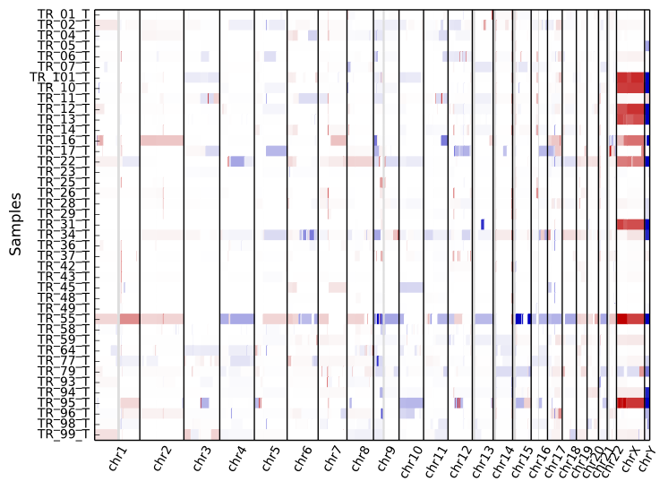
heatmap
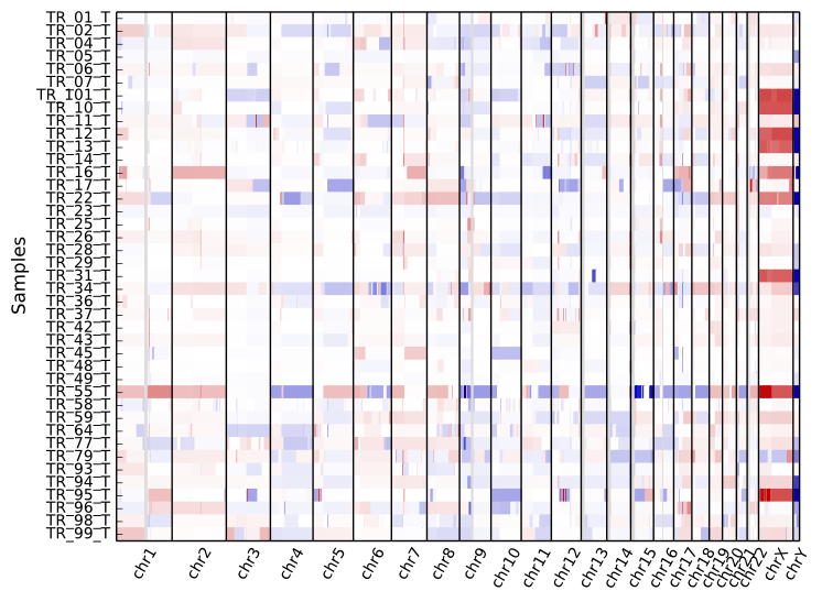
Draw copy number (either bins (.cnn, .cnr) or segments (.cns)) for multiple samples as a heatmap.
To get an overview of the larger-scale CNVs in a cohort, use the “heatmap” command on all .cns files:
cnvkit.py heatmap *.cns
The color range can be subtly rescaled with the -d option to de-emphasize
low-amplitude segments, which are likely spurious CNAs:
cnvkit.py heatmap *.cns -d
A heatmap can also be drawn from bin-level log2 coverages or copy ratios (.cnn,
.cnr), but this can be slow to render at the genome-wide level.
Consider doing this with a smaller number of samples and only for one chromosome
or chromosomal region at a time, using the -c option:
cnvkit.py heatmap TR_9*T.cnr -c chr12
cnvkit.py heatmap TR_9*T.cnr -c chr7:125000000-145000000
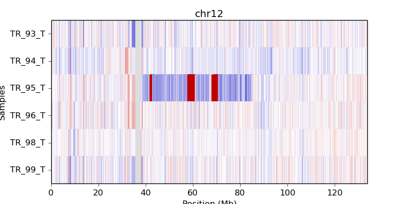
If an output file name is not specified with the -o option, an interactive
matplotlib window will open, allowing you to select smaller regions, zoom in,
and save the image as a PDF or PNG file.
The samples are shown in the order there’s given on the command line. If you use “*.cns” then the filenames might always be fetched alphabetically (depending on your operating system), but if you type them out in the order you like, it should keep that order. You can use the Unix shell to pull the names out of a file on the fly, e.g.:
cnvkit.py heatmap `cat filenames.txt`
As with diagram, the sex chromosomes X and Y are colorized relative to
the expected ploidy, based on the sample and reference sex (see Chromosomal sex).
This correction can be disabled with the option --no-shift-xy.
Customizing plots
The plots generated with the scatter and heatmap commands use the Python plotting library matplotlib.
To quickly adjust the displayed area of the genome in a plot, run either plotting command without the -o option to generate an interactive plot in a new window. You can then resize that plot up to the full size of your screen, use the plot window’s selection mode to select a smaller area of the genome, and use the plot window’s save button to save the plot in your preferred format.
You can customize font sizes and other aspects of the plots by configuring
matplotlib.
If you’re running CNVkit on the command line and not using it as a Python
library, then you can just create a file in your home directory (or the same
directory as cnvkit.py) called .matplotlibrc. For example, to shrink
the font size of the x- and y-axis labels, put this line in the configuration
file:
axes.labelsize : small
For more control, in the Python intepreter (or a script, or a Jupyter notebook), import the cnvlib package module and call the do_scatter or do_heatmap function to create a plot. Then you can use matplotlib.pyplot to get the current axis and modify the plot elements, change font sizes, or anything else you like:
from glob import glob
from matplotlib import pyplot as plt
import cnvlib

segments = [cnvlib.read(f) for f in glob("*.cns")]
ax = cnvlib.do_heatmap(segments)
ax.set_title("All my samples")
plt.rcParams["font.size"] = 9.0
plt.show()